Babylights and full head highlights: choose the lines, then the coverage
Babylights and full-head highlights are not opposite choices. Babylights describe very fine lighter strands; full-head describes coverage across the head. You can therefore discuss a fine-strand design with full-head coverage. The useful decision is not which label sounds softer. It is how much lightness you want, where you want to see it and how much dark hair should remain visible.
Start with your everyday haircut rather than a colour name. A fringe worn forward reveals different strands from the same fringe swept back. Longer hair changes again when tucked behind the ears or tied up. Brightness that looks balanced in one front-facing photograph may feel concentrated in a small area during normal wear. Coverage and strand size need separate decisions.
This guide approaches colour as a pattern within a haircut, not a promise attached to a technique. It explains how width, spacing and contrast interact, what a reference photograph can hide and how to describe the result you prefer. The haircut examples are illustrative scenarios, not client accounts. Your existing colour, chemical history and hair condition still need assessment before a plan is agreed.

01
Separate strand size from the area being coloured
Think of the design as two separate questions. How fine should each lighter strand be, and which areas should contain those strands? A full-head arrangement can retain plenty of dark hair. A small selected area can be densely lightened and look striking from the front. Neither coverage nor strand size tells you the final amount of brightness on its own.
For a closer explanation of fine-strand selection, Vit So's page on babylights distinguishes line width from spacing and contrast. That distinction helps when a photograph looks delicate but surprisingly light overall. You may like the narrow lines without wanting their density. Tell the stylist which feature you want to keep and which you would reduce, rather than requesting the photograph unchanged.
In an illustrative example, someone with dark, medium-length hair wants a little movement through the top without an overall blonde impression. Fine strands could describe the line preference, but retained depth describes the colour balance. Simply asking for the finest possible highlights leaves the second question unanswered. A clearer request is fine separation with enough dark gaps to keep the base recognisable.
Conversely, a person seeking brightness from several angles might discuss wider coverage without wanting stronger contrast. This is why partial placement is not automatically the subtler option. A bright front section may draw more attention than gentler strands distributed across the head. Choose the visual priority first, then ask how strand selection and coverage could work together within an assessed plan.
Fine describes the line. Subtle describes the impression. They are not interchangeable instructions.
02
Read width, dark gaps and contrast together
Line width is only one part of what your eye notices. A narrow pale strand against a dark base can remain very distinct. A broader brown ribbon close to the base shade can feel quieter. Avoid using natural-looking as the whole instruction: it might mean small strands, low contrast, uneven spacing or simply retaining your familiar depth around the face.
Look at the darker gaps in your reference as carefully as the highlights. Closely spaced fine strands can merge into an overall lighter impression, particularly at a distance. Wider gaps allow individual lines to remain readable. If you want separation, describe where you would like to see dark hair between the lighter pieces, rather than asking only for more definition.
Now separate tone from contrast. You might prefer warm brown but dislike the amount of brightness in a reference. You might like the brightness but not its cool tone. Naming both preferences avoids treating one photograph as an indivisible instruction. If necessary, bring one image for the strand pattern and another for tone, explaining that neither is a complete result request.
The comparison below is a way to describe preferences, not a prediction of processing or suitability. Two designs can share a strand width and still look very different because their spacing or base contrast differs. During a discussion, identify the feature that matters most and one feature you could compromise on. That gives the conversation more direction than several conflicting colour labels.
| Decision | What to inspect | What to say |
|---|---|---|
| Strand width | Fine threads or broader ribbons | I like this line size, but not necessarily this brightness. |
| Spacing | The dark gaps between lighter pieces | I want my base colour to remain visible between the strands. |
| Contrast | How strongly each strand stands out from the base | I want noticeable separation without such a pale shade. |
| Coverage | The top, sides, back and underneath | These are the areas visible in the hairstyles I actually wear. |
03
Let the haircut decide which views matter
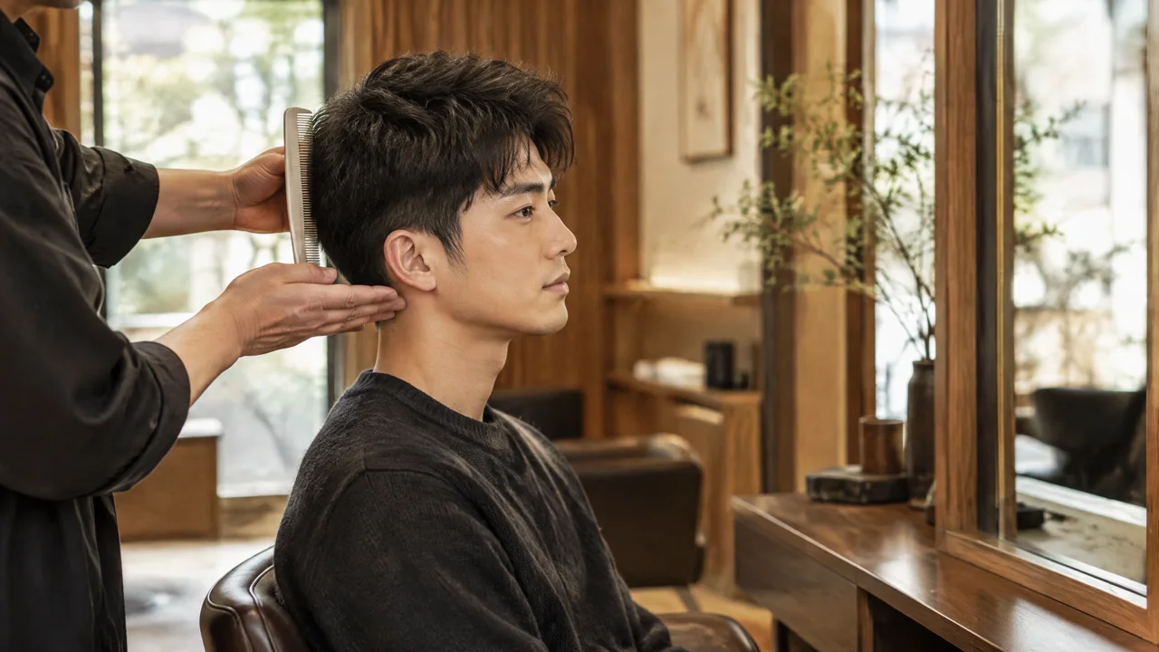
Colour placement sits inside a moving haircut. A shorter men's cut may expose the upper sides when pushed back but conceal them when the fringe falls forward. Photograph both positions if both belong to your routine. A request based only on the styled top can overlook how the colour meets the side shape, especially if a substantial trim is also planned.
Imagine a hypothetical grown-out fringe that is about to be shortened. If most desired brightness sits at its ends, the haircut could remove much of that feature. Show the intended length before discussing placement. This is not an argument for colouring before or after every haircut in a fixed order; it is a reason to agree the final shape and colour together.
For longer hair, loose and tied-back views answer different questions. A ponytail turns some underneath strands outward, while hair tucked behind an ear reveals a side area hidden in a front portrait. These views do not automatically require full-head coverage. They help identify where continuity matters and where you are comfortable keeping depth, so a coverage label does not replace an actual placement discussion.
Check the reference texture as well. Waves can gather separate strands into larger-looking ribbons; straighter styling shows their direction differently. If you rarely curl your hair, bring a reference worn straight alongside the polished image. Also show your usual parting and any alternative parting you use. The design should be discussed in the positions you wear, not only the position photographed.

04
Compare painted brightness without forcing an either-or choice
Balayage describes painted placement, while highlights describe selected lighter strands. These ideas can overlap, so a photograph's caption is not enough to identify the whole design. Look for where brightness begins and whether it appears as separate lines or larger light areas. Fine selection near the face and brighter ends might both be important, even if the reference carries one label.
Vit So's discussion of balayage vs highlights is useful when your references combine several effects. It separates strand definition, placement and root transition rather than treating the names as competing finishes. Use that comparison to identify the features you want to discuss. It does not establish which method your own hair can support or confirm the work for an appointment.
For an illustrative long-hair scenario, imagine liking fine lines at the hairline but broad brightness below the shoulders. Asking only for babylights could leave the ends preference unclear. Asking only for balayage could miss the fine front detail. Describe the two zones separately, including how much darkness should connect them. The appropriate approach can then be discussed without forcing the picture into one category.
Foils are another separate question. Their presence does not prove that a finished design will look sharply striped, and a painted appearance does not prove a gentle chemical process. Ask what the proposed method is intended to achieve in your starting hair. Keep the desired pattern distinct from assumptions about products, processing or a particular salon's available techniques.
05
Treat the hair history as part of the design
Your roots, middle lengths and ends may have different histories. Untouched roots should not be treated as identical to lengths carrying dark dye or previous lightening. Show any bands of old colour, uneven brightness and pieces you would like to retain. Reusing an existing light pattern may be worth discussing; a new inspiration image does not automatically mean starting again throughout the hair.
Record approximate dates for colouring, bleaching, home dye, henna, perming and straightening, including work still present in the lengths. Product names are helpful when available, but uncertainty should be stated rather than filled with guesses. Mention roughness, catching during combing or visible breakage. These observations let suitability enter the conversation before the desired brightness becomes an assumed commitment.
A fine or softly blended appearance does not establish low damage. The American Academy of Dermatology warns that colouring and perming can leave hair dry and brittle. Its guidance also advises stopping and seeking medical help if colouring causes excessive burning or stinging. These safety points apply regardless of how delicate the intended highlight pattern looks.[1] They do not assess whether a particular design suits you.
Share past reactions separately from your colour history. The FDA advises following hair-dye label directions for skin testing and avoiding dye on an irritated or damaged scalp. Previous uneventful use, or a negative test, does not rule out a reaction.[2] Ask about the instructions for the actual products proposed. An online style comparison cannot clear a scalp concern or replace individual assessment.
A soft-looking colour reference tells you about appearance, not how much processing your hair can tolerate.
06
Plan upkeep as roots, tone and texture
Maintenance becomes clearer when you separate three observations: darker new roots, a change in the lighter strands' tone and a change in how the hair feels. They are not interchangeable problems. A root boundary can become more noticeable while the lengths still have a tone you enjoy. Equally, the root pattern may feel acceptable while the ends need a condition-focused discussion.
Before choosing lines close to the scalp, decide how comfortable you are with visible regrowth. Some people enjoy a darker root beside light ribbons; others dislike a clear boundary. Fine strands do not guarantee invisible growth, especially when densely arranged or strongly contrasted. State how often you realistically want to revisit the colour, but do not infer a universal return interval from the technique name.
Tone deserves its own priority. A warm highlight is not automatically an error that needs cooling. Agree whether warmth belongs in the desired finish before buying a toning product. If the colour later seems different, photograph the same area in similar daylight and note the products used. That makes the enquiry more specific than saying the highlights have gone wrong.
Ask for care instructions tied to the actual service and your normal routine, including heat styling and swimming. Do not assume a collection of products makes further lightening suitable. If hair feels rougher or starts breaking, report that alongside any colour concern instead of repeatedly applying colour at home. The table helps organise what you observe; it is not a treatment plan.
| What you notice | Useful detail to record | Question for the discussion |
|---|---|---|
| A more visible root boundary | Usual parting and the point where the light strands begin | Can we discuss retaining more depth rather than moving all brightness upwards? |
| A different tone through the lengths | Comparable daylight photographs and recently used products | Is this different from the warmth or coolness we originally intended? |
| Too little dark separation | Areas where the light pieces appear to merge | How could the next plan preserve more visible base colour? |
| Roughness or breakage | Affected areas and relevant chemical or styling history | Should further colour work be reconsidered after assessing this condition? |
07
Turn the comparison into a precise enquiry
A useful enquiry describes the visual goal and the starting point together. Try: I want fine strands through the top, visible dark gaps and brightness when the fringe is pushed back. Then add current photographs and the hair history. This is a hypothetical wording example, not a recommended formula for everyone. Its value is that each part answers a different design question.
When coverage across several areas matters, Vit So's full head highlights information explains why full-head does not mean every strand becomes light. Use it to frame questions about the hairline, crown, sides and back. Confirm the boundaries proposed for your own haircut, the applicable quotation and what work is included. A listed entry is not confirmation of an individual colour plan.
State your priorities in order. If keeping a dark overall impression matters more than reproducing a pale reference tone, say so. If brightness at the front matters more than continuity underneath, explain that too. Include your intended haircut, available time and budget. Ask how any additional lightening or separate work would be confirmed rather than assuming another service's inclusions carry over.
The strongest comparison ends with fewer assumptions, not with a winning label. Babylights describe fine selection; full-head describes coverage; contrast and density decide much of the impression. Keep those choices separate and you can explain both what attracts you and what you do not want. Suitability, method and appointment arrangements still need confirmation after the relevant information has been reviewed.
- Send current front, side and back photographs in natural light, showing roots, lengths and ends without a colour filter.
- Show your normal parting and a second everyday position, such as a pushed-back fringe or tied-back hair.
- Annotate the reference with the line width, dark gaps and tone you like, plus one feature you want changed.
- List chemical history, planned cut length and upkeep preferences; ask for confirmation of suitability, scope, inclusions and quotation.
Sources and useful reading
Continue with hair and grooming
Continue with Canvas Texture’s male hair needs: Korean Men's Perm
Explore another related decision: Balayage on dark hair and ombre: plan the contrast
Read the lead stylist’s background: Vit So and the Canvas Texture studio
Discuss your men's hair priorities with Canvas Texture
Contact Canvas Texture for a consultation about your male hair needs. Bring current photographs, your preferred haircut and any colour or texture-treatment history so you can discuss the shape, appearance and upkeep that matter to you.
Canvas Texture · WhatsAppFrequently asked questions
Can babylights be placed across the full head?
The terms can describe the same proposed design: babylights concern fine strand selection, while full-head concerns coverage. They do not specify density or final brightness. Ask which areas would be included and how much dark hair would remain; suitability and scope need confirmation.
Are finer highlights always less noticeable?
No. Strong contrast can make a fine strand stand out, and many closely spaced fine strands can create substantial overall brightness. Discuss strand width, spacing and contrast separately rather than relying on fine as a complete description.
Do I need full-head coverage for a short men's haircut?
Not automatically. The visible areas depend on the cut, fringe direction and how the hair moves. Show the top, sides and back in your normal styling positions, along with any planned trim, before discussing coverage.
Can I choose the design from a single reference photo?
A photograph can start the discussion, but may hide the underneath, root boundary or effect in a different texture. Explain which details you like and add current photographs, your chemical history and maintenance preferences. The image alone cannot establish suitability or the required process.
Related journal articles
Hair salon or hair stylist: what should you compare?
Choose the appointment around the change you need, not the most impressive title on the booking page.
Haircut, wash cut and blow dry: choosing the right family appointment
A family can share a journey to the salon without sharing the same haircut brief.

A layered haircut for busy days: choose what to keep
The most useful length is not always the longest strand; it is the shortest piece your routine still needs.